Navarre
December 8, 2022, 1:48am
#1
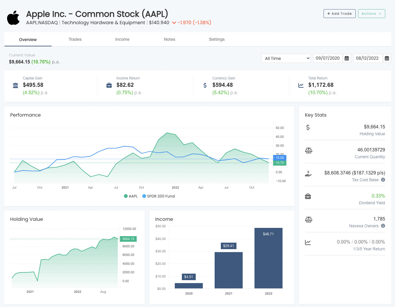
Today we have release a massive update to the holding screen within Navexa.
We have improved the overview tab to provide a much better look into how your holding is performing.
We have added the date range selector so you can now view performance based on custom ranges.
We have added the performance chart with benchmarking (for paid users).
We have moved Trades and Income into their own respective tabs.
We have also improved the news section on the overview tab as well.
Let us know what you think!
3 Likes
AnthD
December 9, 2022, 2:03am
#2
It’s great but we still can’t use custom classifications to confirm diversifications across different sectors. Some of my ETF’s and shares don’t come under the standard classifications Navexa provides.
2 Likes
NLeed
December 9, 2022, 9:08am
#3
Thanks, I like the improvements, well done.
1 Like
Navarre
December 9, 2022, 11:15am
#4
Hey @AnthD can you post this in the ‘Feature Request’ category? I’d love to hear other peoples feedback on this.
Navarre
December 9, 2022, 11:15am
#5
Hey @NLeed yes that one is on the list to resolve.
Vince
December 11, 2022, 4:51am
#6
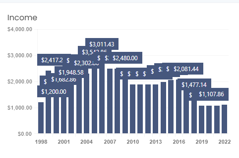
Great feature guys, helps me to see each investment in a whole new light! A couple of things to consider I have a couple of older investments 10+ years which did not load at all first time and took a bit of back and forth before they finally showed up. Secondly the Income section graphs get very crowded when covering multiple years
Navarre
December 11, 2022, 6:39pm
#7
Hey @Vince , which holdings was it specifically that had trouble loading?
Also we will sort that chart out today!
Vince
December 12, 2022, 3:27am
#8
Hi Navarre,
Navarre
December 12, 2022, 11:33pm
#9
Hi @Vince we have fixed up the chart looking cramped.
We will look into why those holdings were slow to load and get it resolved.
Having a custom classification for ETFs is a good idea. Inbuilt classifications are not ideal for ETFs. @AnthD let’s raise a new Feature request.
1 Like
AnthD
December 13, 2022, 3:40am
#11
I’ve tried a few times, no dice…
Vince
December 26, 2022, 7:14am
#12
@Navarre thanks for the update looks much better. Any chance in adding a call out or something similar on the chart when you hover over a bar on the chart to see the actual value?
Navarre
December 26, 2022, 9:49pm
#13
Hey @Vince , yes that will get done shortly!
Navarre
December 26, 2022, 9:50pm
#14
Hey @AnthD if you create a post under ‘Feature Requests’ we use the number of votes on it as an indication on how high it should be prioritised.
We have a small team, so we have to be pretty ruthless with what features we build and when.
Vince
December 28, 2022, 3:32am
#15
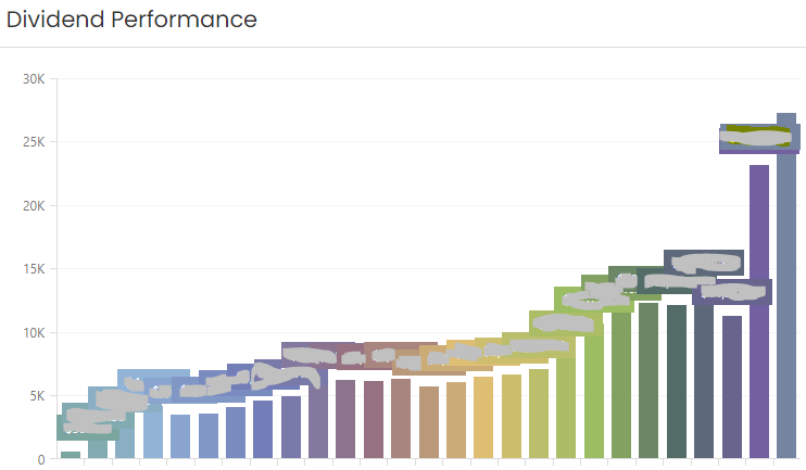
You may want to take a look at the dividend screen on the portfolio page which is also a bit crowded when you have many years of holdings.
In the performance graph, how the right hand side scale figures are worked out? Will be very useful to effectively utilize the graph. Thanks